2/20/2021
There is a music talk I this week which I found it quite interesting. I understand more on how music works in game, understand what will be helpful for the musician to create music for the game.
Progress
After finishing the basic mesh of the buildings I took a little break from creating 3D models and spend some time redoing the concepts of the game. By the end of this week I start working on the character model again and hopefully finishing it by next week.

Concept art update (research)
During the talk with James last week our team agreed that the set and atmosphere will be crucial to the game. So I decided to redo the mood-board for our game. Giving a better idea to the team on how I am imagining the game at this point.

During the planing phase, I hoped to have a cel shading. However, it didn’t turn out as what I wanted and I got another look which is not too bad. Looking back at that picture, I realise it is way to bright and did not match the atmosphere. I hope for a gloomy, dystopian and noisy environment.
Other James mentioned how to use darkness to hide parts in the city. For example, the city is floating in the sky and using the dark could help hide what is outside the map. The following are the studies that I’ve done:

I am personally a fan of neon light and it matches with the city in Hong Kong. However making the city that dark could be a problem for the player to observe the environment from a distance. Further more a neon light city does not completely match the idea of a dystopian city, instead it feels like a developing cyber city. From the colour study I did I notice that artist make use of the “colour of air” to create a gloomy or heaviness in the environment. I conclude the use of thick fog is what I think works the best for the city.
From the reference pictures, the buildings do have different colours. But they are still mainly pale and dark. I picked out colours and chose those which are repeatedly used to find similarities between. What I observe is they all have low brightness and even the most attractive colour sill has a really low colour saturation. I conclude an area to pick the colours and will be using it to paint different buildings in the city.
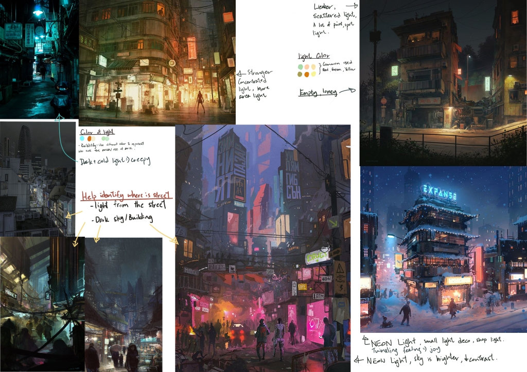
The use of light in the city will also be really important. It helps to guide the player in the city, indicate important locations(such as landmark buildings) and it could be a possible mechanic in the game(we had discussion on turning off light in a district using a cable connecting puzzle). Using the lightings correctly can help tell stories and make the environment fruitful. For example I had an idea to use lights to identify the ownership of the land . This could help support the underlaying narrative of the game.
In general, the lighting of this city shouldn’t be too strong. They should be concentrated on the bottom of the city(close to the streets). This could help player identify the roads better and know where the enemy will travel through. The light source will be scattered and weaker as it gets further from ground. The colour of light is also something to pay attention to. For example blue lights makes the environment feels empty and creepy; a mixed use of warm colour creates a busy city vibe.
